An inclusive approach to designing printed materials benefits everyone. It especially benefits people who rely on information to help them plan a visit, or to make the most of their experience on site. Including alternative formats such as Braille and Widgit can benefit people with sensory impairments, learning disabilities and people who don’t use English as a first language.
Benefits of making your printed materials inclusive
- General information is easy to use because it has clear layout and fonts, and it uses principles of Plain Language.
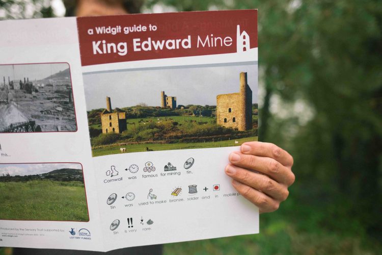
- Alternative formats are available such as Large Print, Easy English, Braille, Widgit and alternative languages.
- Visitors can enjoy information together because alternative formats are available alongside standard materials.
- Digital information is designed to be accessible, with clear layout, straightforward navigation and compatible with screen reading software.
- Information uses images and illustrations that represent a diversity of people.
Recommended layouts and formats
- Use clear, simple layouts that avoid information overload and make it easy for people to find what they are looking for.
- Principles of Plain English should be applied to all written information.
- Producing materials in alternative formats will welcome a wider diversity of visitors and show that you expected them to come. Alternative formats should at least be available to provide on request.
- Text should be left-aligned as this makes it easier to track the start of sentences.
- Do not place text over illustrations, photographs or patterns that make it harder to read the text.
Recommended fonts and styles
- Ensure good colour contrast between font colour and background as this makes a huge difference in how easy something is to read.
- Avoid printing on glossy or reflective paper because it will produce glare.
- Choose a legible font, avoiding ones that are unusual or particularly decorative as these are harder to decipher. Sans serif fonts, such as Arial and Calibri, are usually highlighted but many more fonts have been designed to be clear and easy to read, and this includes some serif fonts. Charity Comms has a great resource here
- For something that is for reading close up, apply a font size at least equivalent to 12pt in Arial (some fonts are smaller so it is important to compare and adjust as required) and ideally above 14pt.
- Avoid using italics and ALL-CAPS, except sparingly, as it generally makes the pattern of text harder to read.
- If text is reversed out (e.g. white on black background) the font may need to be bold to ensure it is clear enough. Note that this style can be more tiring to read so is best avoided for long sections.
- For posters and display boards, a larger font should be used.
- Use text colour which will provide a strong contrast with the background colour.